Turn Quick Mobile Searches into Booked Service Calls with Better UX
How many of the calls a plumbing business missed last month never rang the phone at all, because the person searching gave up on the website before dialing?
That question does not get asked in most shops, because there is no line item for a call that never happened. The invoice book only shows what got booked. But a website that hides its phone number, buries its service area, or makes someone hunt for a contact form is not a passive cost. It is an active leak, and it happens before dispatch ever hears about it.
Where Do Plumbing Websites Lose Ready-to-Call Customers?
A plumbing website is not a brochure sitting on a shelf. It behaves more like a front desk that never closes, staffed by whatever a visitor sees in the first few seconds on their phone. When that front desk is clear, a caller with a leaking pipe finds the number and dials. When it is not, they close the tab and try the next result.
Picture the ordinary version of this: someone searches for emergency plumbing help at eleven at night, taps the top result, and lands on a homepage built around a slideshow of finished bathrooms. No phone number above the fold. No mention of after-hours service. They scroll, they wait for images to load, and they leave.
That is a lost call, not a lost visit, and the difference matters because a lost call is revenue with a name attached.
Good plumber website design treats every page like it might be someone’s only chance to reach a real person during an emergency, which is why service relevance and contact access need to sit at the top of the page, not somewhere a thumb has to work to find. A homepage that fails this test is not a marketing problem. It is a staffing problem the business does not know it has.
Can a Visitor Understand the Plumbing Offer in Three Seconds?
Give a visitor three seconds on a plumbing homepage and ask what they walk away knowing.
Do they know what the company does, where it works, and how to get in touch?
A 2026 service-business web guide frames this as the basic test any service homepage has to pass, and for a plumber it is the difference between a call and a bounce.
A vague hero section fails all three. A generic tagline about quality and reliability says nothing about service area or reachability, so a visitor with an overflowing toilet has to keep scrolling to find out if the company even covers their address.
Contrast that with a hero area that states the service plainly, names the area covered, and puts a phone number or request button in the same glance. That is a diagnostic benchmark, not a guarantee that traffic converts. Passing it does not promise a booked job. Failing it reliably costs attention the business already paid for, whether the click came from an ad or an organic result, which is the more useful way to read the three-second standard.
Is the Mobile Path to a Service Call Actually Friction-Free?
Most plumbing traffic now arrives on a phone, often from someone standing in a flooded utility room rather than browsing at a desk. That context changes what “working” means. A site can look complete on a laptop and still fail the person it most needs to serve, because the two devices ask different things of the page.
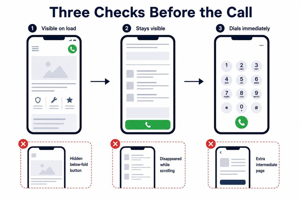
Run the sequence on an actual phone, not a simulator. Open the homepage from a fresh search, the way a stranger would, and time how long it takes to load. Slow performance does not just annoy; a 2026 plumbing website guide ties sub-three-second load times directly to conversion actions, because a page that stalls loses the visitor before the pitch even loads.
Where Is the Call Button When It Matters?
Look for a click-to-call action that stays visible without scrolling, ideally pinned to the screen as the visitor moves down the page. If the phone number only appears in a footer, or worse, inside a contact page two taps away, the visitor has already done more work than an emergency situation should require. The number itself needs to be tappable, not just printed as text, so a thumb triggers the call instead of forcing a copy-paste into the dialer.
What the Test Should Confirm
A proper click-to-call check answers three narrow questions, and all three need a yes before the button counts as working:
- Is it visible on load, meaning the visitor sees it without scrolling on a standard phone screen, not just on a large-format device.
- Does it stay visible, either pinned to the header or reappearing as a sticky element once the visitor scrolls past the hero.
- Does tapping it dial immediately, with no intermediate page, no copy step, and no redirect that adds a beat of hesitation.
A button that passes the first two checks and fails the third has not solved anything. It has just moved the friction one tap deeper.
Does the After-Hours Path Actually Reach Someone?
Test what happens outside business hours specifically, since that is when urgency runs highest. The after-hours number, where one exists, should appear on every page, not just a dedicated emergency page a stressed visitor is unlikely to find. Guidance from a 2026 plumbing website playbook recommends exactly this placement, and the reasoning holds regardless of who publishes it: consistency removes a decision point at the worst possible moment.
Finally, submit the shortest form available:
- using a real name and number
- note how many fields stood between the visitor and a submitted request.
A 2026 plumbing design article points to booking forms:
| that take under sixty seconds as the target | built around minimal fields rather than a full intake questionnaire |
|---|
Anything longer belongs on a follow-up call, not the first screen.
How Can the Seven C’s Guide a Plumbing Website Redesign?
Before committing to a full redesign, a seven-part audit gives a faster read on where a plumbing site actually loses people. The terminology shifts slightly depending on who is teaching it, but the seven ideas consistently used are context, content, community, customization, communication, connection, and commerce. Each maps onto a real decision a homeowner makes on the way to picking up the phone.
| The C | How It Shows Up on a Plumbing Page | What It Affects |
|---|---|---|
| Context | Layout signals urgency and service type at a glance | Whether a visitor keeps reading or bounces |
| Content | Service pages describe the actual work, not generic copy | Confidence that the business does this specific job |
| Community | Reviews, testimonials, and local references feel genuine | Trust before first contact |
| Customization | Pages address specific problems like water heater failure or slab leaks | Relevance to the visitor’s exact situation |
| Communication | Phone number, hours, and after-hours routing are clear | Speed from decision to dial |
| Connection | Forms, chat, and click-to-call all function without friction | Whether intent turns into a submitted request |
| Commerce | Booking or quote request completes without unnecessary steps | Whether the visit becomes a scheduled job |
None of these rows describe a color palette or a font choice. They describe obstacles between a decision and a booked call, which is why the audit works better as a priority list than a redesign brief.
A business with a dated visual style but a working phone button and a fast-loading page is closer to healthy than one with a striking homepage and a broken contact form. The order matters too. Fixing communication and connection issues, such as a hidden phone number or a ten-field form, tends to matter more immediately than rewriting service descriptions, because the first two sit directly in the path of someone who already decided to call. Cosmetic work can wait. A dead click-to-call button cannot.
Which Pages Help a Homeowner Choose a Plumbing Service Fast?
A homepage cannot carry the whole sales conversation, and trying to make it do so is part of why visitors get lost. Its real job is routing: send the visitor to the specific page that answers their specific question, quickly enough that they never wonder if they landed in the wrong place.
A workable page structure follows a short, repeatable sequence:
- Homepage links directly to the handful of services that generate the most calls, using labels a homeowner would actually search, not internal department names.
- Each service page states what the job involves, gives a realistic sense of when it applies, and ends with one clear next action, either a phone number or a short request form, not both competing for attention.
- Service-area pages exist only where the business genuinely dispatches technicians, naming the actual towns or districts covered rather than a broad radius claim that cannot be backed up on a bad day.
- FAQ or educational content appears only where it answers a question a homeowner has before calling, such as what counts as an emergency, not as filler to pad word count.
Every city, neighborhood, or landmark reference on those service-area pages needs a human check against where trucks genuinely go before anything publishes, since a wrong claim damages trust faster than a plain page ever could.
What Makes a Plumbing Website Feel Safe Enough to Contact?
A visitor who has found the right service page and the right phone number still has one more hesitation to clear: is this business legitimate enough to let into a home. Trust signals answer that question without requiring the visitor to research the company separately.
Consistent name, address, and phone details across the site, matching whatever appears elsewhere, reduce the sense that something does not add up.
Visible hours, an accessible privacy or security note, and a valid SSL certificate handle the quieter concerns a visitor may not name out loud but still feels.
Genuine customer reviews carry more weight than a stock testimonial slider, particularly when they include names, dates, or specific job details rather than generic praise. A 2026 plumbing website guide recommends embedding reviews with that kind of verifiable context rather than paraphrased quotes with no attribution. Trust badges from recognized organizations add a similar signal, but only when they are accurate and current.
Emergency or same-day language belongs on the page only when the business can actually deliver it. A promise the dispatch schedule cannot support does more damage after the call than the missing promise ever would have done before it.
How Should Local Search Pages Support Booked Service Calls?
Local relevance is not a badge to display. It is a filter that tells a visitor, before they pick up the phone, whether this business can actually reach their address. Getting that filter right protects dispatch from calls that were never going to convert and protects the visitor from a wasted call.
A workable sequence for local pages looks like this:
- Align contact details everywhere. The phone number, business name, and service claims on a local landing page should match what appears on the homepage and footer, with no version drifting out of date after a schedule or coverage change.
- Label service-area pages precisely. A page for a specific plumbing need, such as water heater repair, should connect clearly to the areas actually served, rather than a vague regional claim with no operational backing.
- Keep phone and request access on every landing page. A visitor arriving from a search ad or an organic result should not have to navigate to a separate contact page to find a way to reach the business.
The implication runs the same direction for paid and organic traffic alike: local pages exist to confirm fit before a call reaches dispatch, not to manufacture coverage claims the trucks cannot back up. A visitor who confirms fit quickly calls with realistic expectations. One who guesses wrong becomes a call dispatch has to turn away.
Getting the fundamentals right across all of this, from hero section to local pages, is less about following a trend and more about matching what a stressed visitor actually needs in the moment they land. A plumber website design built around that need tends to outperform one built around what looks impressive in a portfolio.
What Should Be Fixed in the Next Forty-Eight Hours?
None of the diagnostic work above requires a developer on day one. It requires a phone, a stopwatch, and an honest look at what a stressed visitor actually experiences.
- Start by documenting the current phone-to-call and form path on a real mobile device, the same way a first-time visitor would encounter it: search, land, scroll, attempt to call, attempt to submit a request. Write down what worked and where the friction sat, because this baseline is the only way to know later whether a fix actually helped. Nothing that follows means anything without this first.
- Next, correct the single most visible barrier found in that walkthrough, whether that is a phone number buried below the fold, a booking form with too many required fields, or a load time slow enough to lose patience. One fix, chosen for visibility rather than convenience, matters more than a long list attempted at once, because a business trying to fix everything simultaneously loses the ability to tell which change actually moved the number.
- Then track call volume and form submissions against the days immediately before and after that fix, using ordinary call logs and form notifications rather than anything elaborate. This step has to come last, since measuring before the repair only confirms the problem that prompted it in the first place.
The order runs baseline, then repair, then observation, because a repair with no baseline proves nothing and observation without a fix just repeats the original problem. The one thing to do today is simple: complete the mobile call-path test and write down exactly where it broke.